My design process usually is kicked off by output of sharpie onto note or grid paper, quickly sketching out patterns and ideas as I try to get an initial grasp on what the goal of the project or client truly is.
I also go through my notes and revisit sites that have inspired or intrigued me, regardless if they are similiar in functionality to the project I'm designing. For example I studied retirement calculator patterns when trying to design a model for predictive coding, a machine learning process that attempted to cut down on human effort and error in the legal review process.
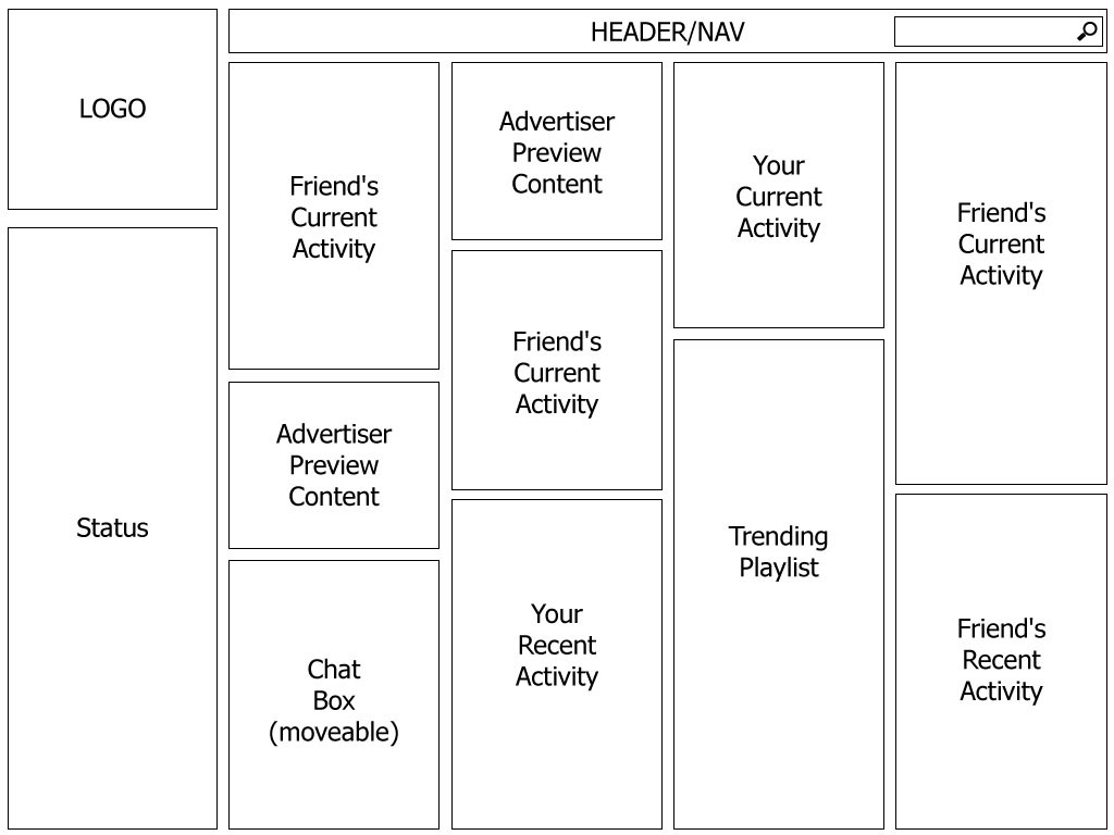
As I began to brainstorm this site/app I envisioned the site being responsively designed and scalable across multiple platforms although this pattern currently is trending much more in a tablet/laptop/desktop direction.
The side column would show which friends were on or "plugged in" as well as which friends weren't. When a friend's name was double clicked, their card would pop into the play area and the user could then begin to interact with it.
Initially I had the cards very rigid in form but as the process expanded I realized they should be very adaptable in their size and function. That they could not only show what was being listened to now, but also what a friend had listened to recently even if they were not currently "plugged in". The cells could also be used as chat windows, playlists, and even introduce paid advertiser content where either whole songs or snippets could be integrated into the UI.
The UI is getting a bit busy and I would certainly refine it further. Each "card" can flipped to show more info and actions such as title, length, artist, etc. Also the user would be able to "like" and add titles, rate them as well as be able to go to an artist site, amazon catalog, you tube channel, etc. The user would be able to see where a friend was on the track as well as listen to the track as the same time. Also some basic user info about the friend as well as quick chat window would be available.

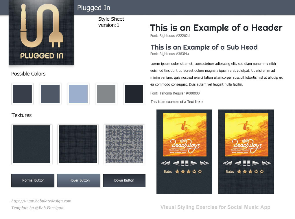
This is the beginning of solving some basic visual design problems; with this style sheet I'm starting to explore color and texture as well as font choices in photoshop. I can later build the style sheet up into a higher fidelity model but I really don't want to be too focused on UX/UI at this point. I'm try to keep the initial style sheet more as an exercise in getting the right look and feel as far as the atmosphere I'm trying to create on the site or for the app. This will be the sandbox for fonts, textures, colors, etc.